Customize Size with Tailwind CSS Breakpoints
📚 Table of Contents
- 1. Introduction to Lovin CSS and Breakpoints
- 2. Understanding Breakpoints
- 3. Screen Sizes Overview
- 4. Customizing Screen Size
- 5. Setting Up a New Project
- 6. Running the Watch Command
- 7. CSS and HTML Integration
- 8. Adding and Modifying Screen Sizes
- 9. Understanding Extend in Lovin CSS
- 10. Conclusion and Future Topics
1. Introduction to Lovin CSS and Breakpoints
In today’s day and age, the graphic design of web applications or websites on different screens is very important. Tailwind CSS gives developers a very easy to use framework which follows a utility-first approach. One of the crucial aspects of responsive web design is the concept of break points. This article will focus on widening the scope of Tailwind CSS by showing how you can use breakpoints to control sizes in a more efficient manner.

2. Understanding Breakpoints
A breakpoint is a set width within a responsive web design where additional styles can be added to achieve a different layout. There are five default Tailwind CSS breakpoints that target different devices. These breakpoints allow developers to add or remove styles on certain viewports. Hence it is very important to learn how can do so in your CSS to make it more responsive.

3. Screen Sizes Overview
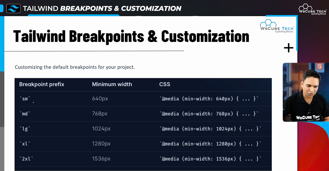
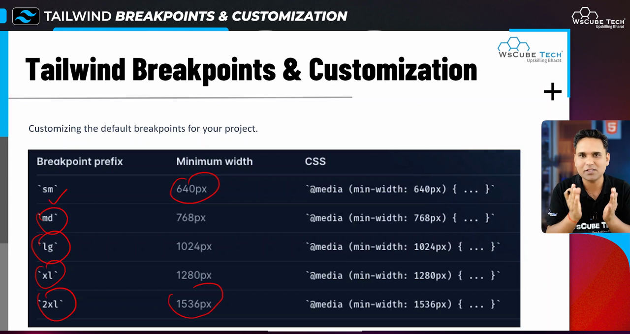
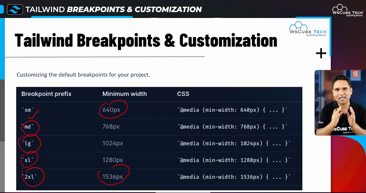
Tailwind CSS implements the following breakpoints, each targeted to specific screen sizes:
- AM: 640px (for smaller screens, for instance mobile screens).
- MD: 768px (for medium screens, which are tablet screens).
- LG: 1024px (for large screens such as laptop computers).
- XL: 1280px(for extra large screens, such as standard desktop monitors).
- 2X: 1536px and above (very large screens)
All of these sizes are defined in a way that allows users to apply different styles in responsive design for different devices. Knowing this sizes can be a great help when designing.
4. Customizing Screen Sizes
Your UI can be even more attractive with the help of Tailwind CSS’s default breakpoints that are easily adjustable to suit your design. There are usually cases where the default breakpoints aren’t enough whether creating a complex web application or a simple static web page. To change them, the Tailwind configuration file needs to be edited for adding or removing breakpoints.
5. Setting Up a New Project
To start using Tailwind CSS, set up your project using Command Interface (CI). Here are the essential steps:
- Initialize your Node.js project using
npm init -y. - Install Tailwind CSS via npm
npm install -D tailwindcss - Create a configuration file with
npx tailwindcss init. - Set up your project files, including
index.html, which will be used to serve your CSS.
Each of these steps is vital for laying the groundwork for your responsive design utilizing Tailwind CSS.
6. Running the Watch Command
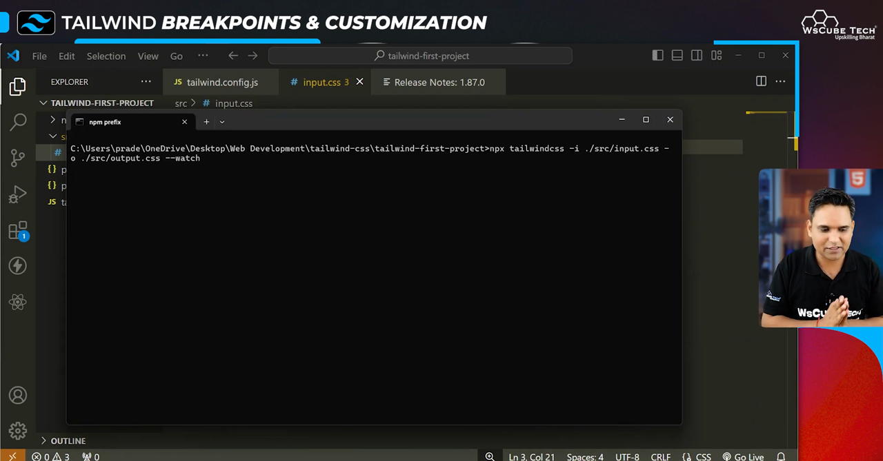
A key command in Tailwind development process is the watch command. This command looks after the CSS files in an ongoing manner, and updates the produced CSS in real time, giving you a live view of the changes. The watch command may be issued by executing:
npx tailwindcss -i ./src/input.css -o ./dist/output.css --watch.
Keeping this command active throughout your development process provides an efficient workflow.
7. CSS and HTML Integration
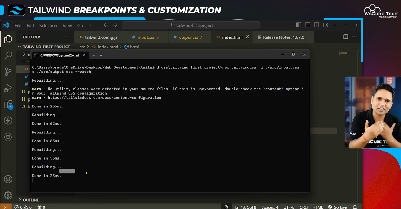
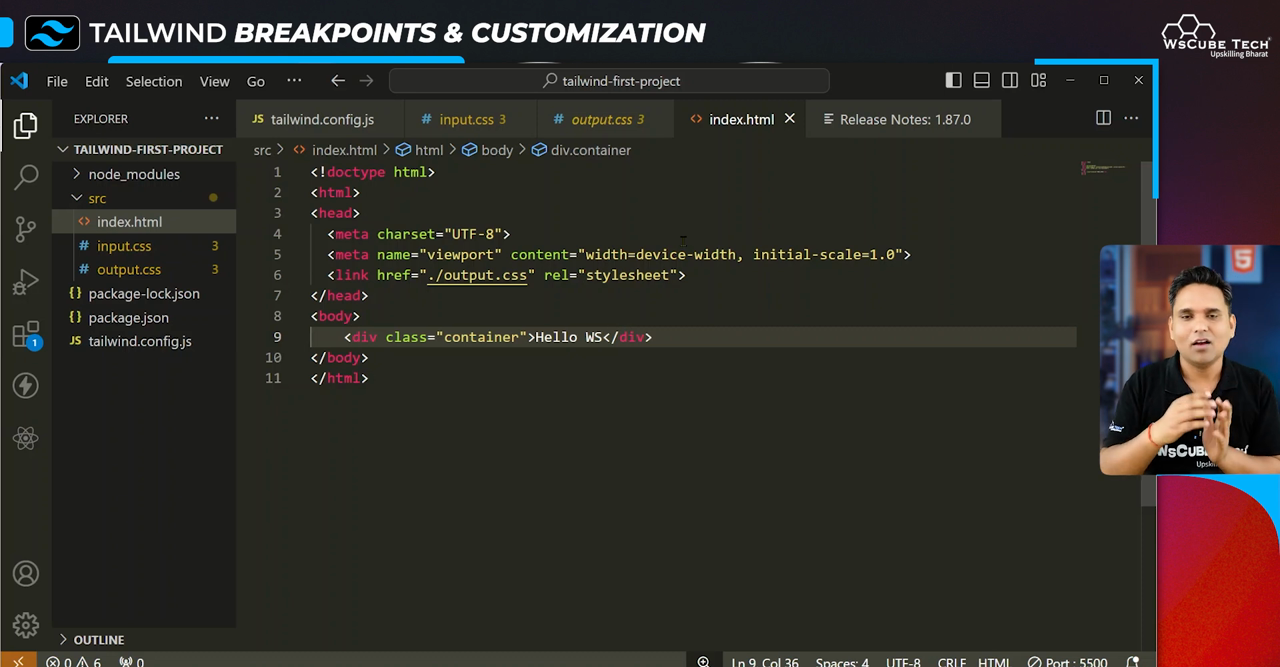
Integrating CSS into your HTML is straightforward with Tailwind. In your index.html, link to your compiled CSS file within the
tag:
<link href="/dist/output.css" rel="stylesheet">Once this is done, you can start applying Tailwind’s utility classes directly in your HTML tags. This seamless integration allows for rapid iterations and visual adjustments.
8. Adding and Modifying Screen Sizes
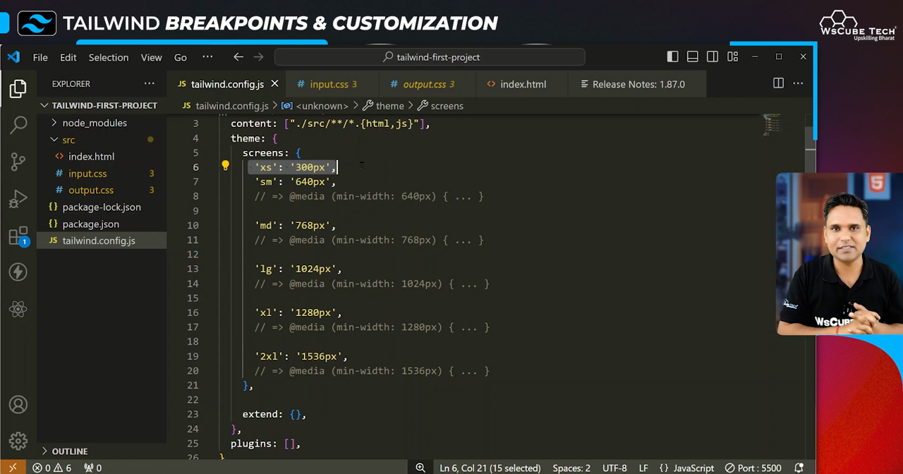
In addition to the default breakpoints, additional or modified sizes can easily be added to your Tailwind configuration file. For example, if you wish to establish a breakpoint that would apply to any screen with a width greater than 1600px, you would have to edit the config file in this manner:
theme: {
              screens: {
                '2xl': '1600px',
                ...
              }
            }
Such customizations enable more tailored designs that cater to unique project requirements.
9. Understanding Extend in Lovin CSS
Tailwind CSS comes equipped with many functionalities, and one of them is the “extend” functionality which permits you to create new utilities or edit the already existing ones without deleting the defaults. For instance, padding classes or color schemes may be extended without losing the base utility. This option helps to make the design process neat, improves maintainability, and keeps uniformity across your styles. It is our recommendation to use extend for scalable web designs.
10. Conclusion and Future Topics
To summarize, mastering the art of adjusting Tailwind CSS’ breakpoints is crucial for beginners who want to practice responsive web designing. Once we conclude this segment of the series, you will find it easier to navigate more difficult areas such as grid systems after mastering these concepts. The next episode is equally exciting; we will go deeper into the complexities of Tailwind CSS in order to broaden our web development abilities.
