How to Create Responsive Cards in React JS with Bootstrap 🚀
Nowadays, it’s clearly apparent that designing and coding beautiful and responsive web layouts is vital in web construction. In this article, you will learn how to add the Bootstrap framework into your React application in order to develop responsive card components. The process of creating attractive interfaces for the end users is now a lot easier than before with the incorporation of Bootstrap’s excellent grid and readily available elements. Let’s get started!
Understanding Bootstrap and React Components 🛠️
Twitter Bootstrap is one of the most acknowledged CSS frameworks in this respect; it offers an extensive library of various components and utility classes that assist developers in quick-responsive designing. Enhancements can be done in this regard efficiently by using React as a JavaScript library for organizing a dynamic web application interface.
Components are the basic elements in the construction of a React application. They combine UI and functionality and therefore help to write effective codes that can be reused for similar purposes. If you are using Bootstrap in React, it is likely that instead of raw HTML components, you will be using tags which are more component-oriented and give your layout more structure.

Setting Up Your React Project with Bootstrap 📦
Before you start building your responsive cards, ensure that your React project is set up to use Bootstrap. You can add Bootstrap to your project by following these steps:
- Open your terminal and navigate to your React project directory.
- Run the following command to install Bootstrap:
npm install react-bootstrap bootstrap - Import Bootstrap CSS in your
index.jsfile:import 'bootstrap/dist/css/bootstrap.min.css';
After completing these steps, you are ready to start using Bootstrap components in your React application.
Creating Your First Responsive Card 🃏
Now that you have Bootstrap set up, let’s create a simple responsive card. Here’s how you can do it:
import React from 'react';
import { Card } from 'react-bootstrap';

function MyCard() {
    return (


                Card Title

                    Some quick example text to build on the card title and make up the bulk of the card's content.


    );
}

export default MyCard;
In this code snippet, we import React and the Card component from React-Bootstrap. We create a functional component called MyCard that renders a simple card with a title and some text.
Utilizing Bootstrap’s Grid System for Layout 📐
To create a responsive layout, we’ll make use of Bootstrap’s grid system. This system allows us to define how many columns our content should span at different screen sizes.
Here’s how you can implement the grid system in your React component:
import React from 'react';
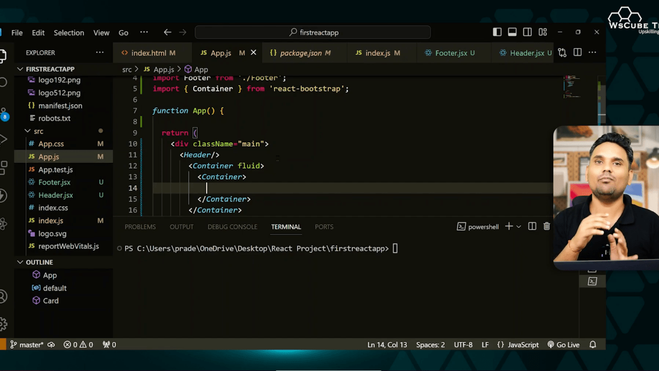
import { Container, Row, Col } from 'react-bootstrap';

function MyGrid() {
    return (


    );
}

export default MyGrid;
In this example, we create a grid with three columns, each containing a card. The md={4} attribute indicates that each column will take up 4 out of 12 available columns on medium-sized screens and larger.

Styling Your Cards 🌈
Bootstrap provides various classes to customize the appearance of your cards. You can easily change the background color, add images, and style the text. Here’s an example:
import React from 'react';
import { Card } from 'react-bootstrap';

function StyledCard() {
    return (


                Styled Card

                    This card has a nice image and text style.


    );
}

export default StyledCard;
In this code, we added an image to the card and centered the text. You can replace image-url.jpg with any image link of your choice.

Creating Multiple Cards in a Row 🎴
To display multiple cards in a row, you can simply replicate the card component within the grid layout. Here’s how to do it:
import React from 'react';
import { Container, Row, Col } from 'react-bootstrap';
import StyledCard from './StyledCard';

function CardGallery() {
    return (


    );
}

export default CardGallery;
This example creates a grid of four cards, each taking up 3 columns on medium-sized screens. You can adjust the md value based on your design needs.

Responsive Behavior of Cards 📱
The most notable benefit that comes with the use of Bootstrap is its responsive design. The grid layout updates itself depending on the size of the screen. For example, on smaller screens, the cards will be arranged up and down to optimize usability.
This feature makes it possible to examine the fluidity of the contents simply by adjusting the size of the browser window or utilizing various devices features embedded within the developer options.
Final Touches: Adding Interactivity 🎉
In order to improve the overall experience of the user, it might be a good idea to introduce some interactivity to the cards i.e. add buttons or hyperlinks. Here’s how you can include a button in your card:
import React from 'react';
import { Card, Button } from 'react-bootstrap';
function InteractiveCard() {
return (
Interactive Card
This card includes a button for more actions.
);
}
export default InteractiveCard;Adding a button provides users with options to interact with the content, making your application more dynamic.
Conclusion: Harnessing the Power of React and Bootstrap ⚡
React combined with the Bootstrap provides an environment where grouping of web application features into pleasing looking cards is possible. Thanks to the component nature of React and the visual richness of Bootstrap, prototyping is fast and the application is enjoyable to use.
As you familiarize yourself with the pair of React and Bootstrap, feel free to play with other components and layouts as well. Happy coding!
